Since 2013 (or thereabouts), investors have lived in a world where there appears to be no alternative to investing in US stocks and the S&P 500 in particular.
And with the benefit of hindsight, investing in the S&P 500 was (in most cases) the right choice. After all, the US large-cap index is up about 250% over the last ten years, compared to a 70% gain for the FTSE 100 and a measly 35% gain for the FTSE 250.
The good news is that a large part of the S&P 500’s growth has been driven by fundamentals, like earnings and dividend growth, but that isn’t the whole story. That 250% gain has also been driven by an increase in the S&P 500’s valuation multiples, and that is why my S&P 500 forecast for 2026 may surprise you (or, if you’ve been around here long enough, it may not).
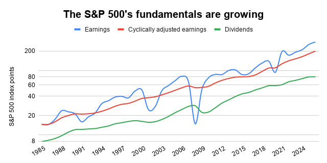
The good news: The S&P 500’s earnings are growing
Some will argue that the S&P 500’s expanded valuation is justified by its heavy exposure to AI winners and tech monopolists. These companies, so the argument goes, will continue to grow rapidly because “software is eating the world”.
I am no AI expert and I have no strong view on the long-term future of the Magnificent Seven (or whatever their current nickname might be). However, I do have an opinion on the S&P 500’s ability to generate earnings growth over a multi-decade period of technological transformation, because we have hard data.
More specifically, over the last 40 years, as the world was transformed by the information superhighway that is the Internet, the S&P 500 grew its earnings by about 7% per year, on average, and that growth rate was fairly stable across those four decades.
If we smooth out the ups and downs of individual years by looking at cyclically adjusted earnings (their inflation-adjusted ten-year average), the picture is broadly the same. Over the last 40 years, the S&P 500’s cyclically adjusted earnings grew by just under 7% per year, on average.
As for the S&P 500’s dividend, it grew by about 6% per year over those 40 years. Why was dividend growth slower than earnings growth? The answer is buybacks. In other words, US companies have gradually shifted away from dividends and towards share buybacks, because that is what most investors seem to want.
In summary then, if we look at the S&P 500’s fundamental growth across earnings, cyclically adjusted earnings and dividends over the last 40 years, we end up with a fundamental growth figure of about 6% to 7% per year.
That is a decent growth rate, but it isn’t significantly faster than the S&P 500’s earnings growth over the last 100 years, which comes in at just under 6%.
This means that during the last 40 years, when the world transitioned from the mostly analogue pre-Internet world to today’s world, where everything and everyone seem to be permanently connected to the Internet, the S&P 500 managed to increase its fundamental growth rate from 5-6% to 6-7%.
And let’s not forget that the last 100 years weren’t exactly short on technological transformations. We had the mass commercialisation of electricity, telephones, radio, television, cars, aeroplanes, consumerism and much more, and yet the S&P 500 still “only” grew its earnings by less than 6% per year.
My point is this: Yes, AI is going to change the world, but it doesn’t necessarily follow that the S&P 500 will grow its earnings over the next few decades at a rate materially faster than that of the last 40 or 100 years. And if the S&P 500’s future earnings growth isn’t likely to be materially higher than its past earnings growth, its current valuation shouldn’t be materially higher than its past valuation.
Unfortunately, therein lies the problem.
The bad news: The S&P 500’s valuation is very high
Over the last 40 years, the S&P 500’s price has gone up by an average of 9% per year, which is 2-3% more per year than its earnings or dividend. With the S&P 500’s price increasing faster than its earnings and dividends, its PE ratio and cyclically adjusted PE ratio (CAPE) should be higher than they were 40 years ago, and its dividend yield lower. And that is exactly what the data shows:
- In 1985, the S&P 500 had a PE of 14, a CAPE ratio that was also 14 and a dividend yield of 3.8%.
- In 2026, the S&P 500 (at 7,188) has a PE of 26, a CAPE ratio of 36 and a dividend yield of just 1.1%.
Clearly, the S&P 500’s valuation is higher today than it was in 1985, but so what? Perhaps the index was cheap in 1985 and perhaps today’s valuation isn’t high at all; it’s just reverted back to normal.
That could well be the case, but it isn’t. For example, over the last 145 years*, the S&P 500 has had an average PE of 16, an average CAPE of 18 and an average dividend yield of 4.2%. On that basis, the 1985 valuation looks fairly typical, whereas today’s valuation is an outlier, with PE and CAPE ratios that are getting on for double their long-term average, and a dividend yield that is less than half its long-term average.
To show you just how extreme today's valuation is, here’s a chart showing the S&P 500 CAPE ratio over the last 145 years (thanks to data from Mr CAPE himself, Robert Shiller).
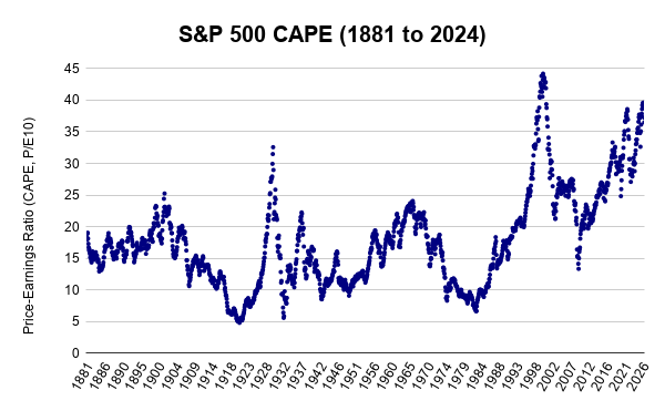
In very broad terms, CAPE mostly stayed between 10 and 20 for the first 100 years or so, from 1881 to 1994. It only went outside that range when investors were either very optimistic (the roaring ‘20s and the swinging 60s) or very pessimistic (World War One, the Great Depression and the 1970s). But since the mid-1990s, things have changed and the S&P 500 has spent most of the last 30 years above its historical range of 10 to 20.
The initial trigger for this sustained re-rating was, of course, the dot-com bubble, with its irrational exuberance and equally irrational valuations. That was a bubble of epic proportions, but bubbles are bubbles because they burst, and from the highs of the dot-com bubble in 2000 to the lows of the credit crunch in 2009, the S&P 500’s price was more or less cut in half.
The 2009 crash was followed by a prolonged bull market that is still roaring today. The belief that There Is No Alternative to US stocks has pushed the S&P 500’s CAPE ratio back into the stratosphere, beyond the highs of the roaring 1920s and close to the unsustainable madness of the dot-com era.
In the last five years alone, we’ve had the meme-stock bubble of 2022 and the AI bubble of today, and while the AI bubble is yet to burst, history tells us it’s mostly a matter of when, not if.
The very bad news: Mean reversion is still a thing
Like other equity indices, the S&P 500’s valuation swings from high to low, as investor sentiment swings from excessive optimism to excessive pessimism. Optimism and pessimism are finite resources that eventually burn themselves out, and that fundamental aspect of human nature is what stops markets from going up or down indefinitely.
As valuations go from high to low, and vice versa, they inevitably cross through their long-term average, although they don’t usually stay there for long. This is known as mean reversion, and it’s as fundamental to index valuations as gravity is to physics.
While some investors believe the S&P 500 has broken free from the shackles of history, at least in valuation terms, I have my doubts.
The optimists will point to the period from 1995 to 2009, where the S&P 500’s CAPE stayed above its historical range of 10-20 for 14 long years. That is a long time, but eventually mean reversion had its way, and in 2009 CAPE fell below its long run average, to a low of just 13.
Today, US bulls point to the short-lived nature of the credit crunch crash and the COVID crash, and the fact that the S&P 500’s CAPE has been above the old 10-20 range since 2012. Yes, that is 14 years (just like the 1995-2009 period), but I see no reason why CAPE won’t return to its long-term average, or lower, at some point in the future, just as it always has in the past.
My assumption is that the rules of the valuation game haven’t changed, and that the S&P 500 will revert to a historically normal valuation at some point, and that has a profoundly negative impact on my one-year forecast.
My S&P 500 forecast for 2026 is surprisingly negative
Nobody knows where the S&P 500 will be at the end of 2026, but I still think we can still come up with useful forecasts that tell us something about the current balance of potential risks and rewards.
In my case, given that we don’t know where the index will be in the future, my forecasts are based on the simple assumption that an index will revert back to its historically average CAPE ratio by the end of the year.
This often leads to very boring forecasts, especially when the index’s CAPE is already close to average, as has been the case for the FTSE 100’s CAPE and FTSE 250’s CAPE for most of the last 15 years.
But that isn’t the case with the S&P 500. The S&P 500’s CAPE is currently 36, which is almost double its 100-year average of 19. My assumption, then, is that the S&P 500’s CAPE will fall to 19 by the end of 2026, and that leads me to write the following somewhat negative forecast:
- My 2026 forecast: The S&P 500 will fall to 3,800 by the end of 2026
For that forecast to come true, the index would have to fall by 47% in the next few months. That sounds implausible, it is highly unlikely and I don't think it will happen, but I do think this a visceral way to highlight the risks investors are exposed to when they invest at such extraordinarily high valuations.
Such a negative forecast is out of kilter with the optimism of most investors, but don’t forget: a bubble is at its highest when optimism is at its highest, and the related downside risks are at their highest when investors believe that investing is virtually risk-free.
My forecast may be too optimistic
If the thought of a 47% decline isn't bad enough, remember that indexes tend to overcorrect during post-bubble crashes. After the roaring 1920s came the Great Depression, after the swinging 60s came the stagflation of the 1970s, and after the dot-com bubble came the 2009 financial crisis. In each case, CAPE went below its long-term average, and sometimes it ended up a long way below average.
As a rule of thumb, the S&P 500’s CAPE tends to stay within a range of about twice its long-term average to half its long-term average. For example, during the 1881-1981 period, CAPE averaged about 15 and it almost never exceeded 30 or fell below 7.5.
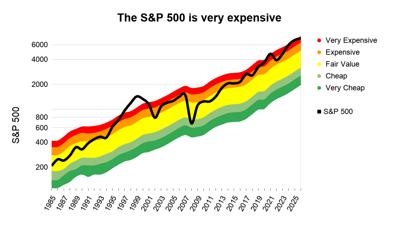
To show you what that range looks like today, here’s the latest version of a chart I've been producing for over a decade.
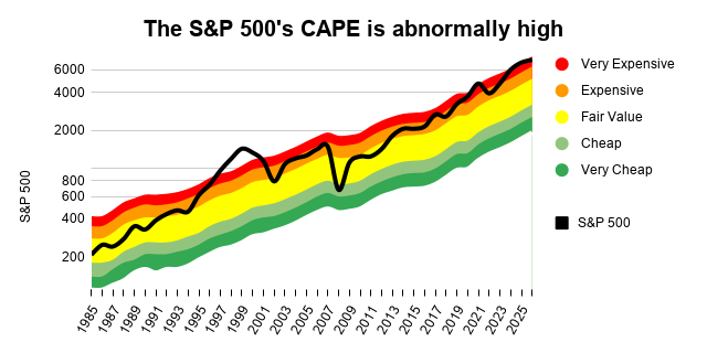
The rainbow shows the historically normal range of values the S&P 500 could have taken at any point over the last 40 years, from very cheap (where CAPE is half its long-term average, shown in green as low valuations are good for future returns) to very expensive (where CAPE is twice its long-term average, shown in red as high valuations are bad for future returns).
My 3,800 forecast sits right in the middle of the yellow "fair value" band, while the S&P 500 currently sits in the middle of the red danger zone. That means the most likely direction of travel, over the medium-term, is down.
* The S&P 500 officially goes back to 1957, but Robert Shiller has kindly pulled together data on what the index's earnings and dividends would have been, if it had existed, going all the way back to 1871.
No time for spreadsheets or annual reports?
If you like this article but don’t have hours each month to dig through company accounts, you might find my monthly investment newsletter useful.
Once a month I send out a plain‑English PDF showing:
- The full UK dividend stocks model portfolio
- Which shares I’m buying, selling, trimming or topping up
- The latest news and trading updates for each holding
- Where we are in the stock market valuation cycle
All designed so a UK investor can stay on top of their dividend portfolio in well under an hour a month.
Get the latest blog posts & a free checklist
Get my latest articles in (at most) one email per week and download my dividend investing checklist. Topics usually include:
- Detailed reviews of high-quality UK dividend stocks
- Updates on my UK dividend stocks portfolio
- FTSE 100 and FTSE 250 valuations
- "How to" articles covering all aspects of dividend investing
No spam. Unsubscribe anytime.