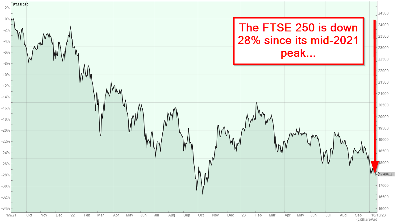
If you’re a UK investor, I feel your pain. The UK stock market hasn't been kind to us in recent years and this is most obviously seen in the unambiguously terrible performance of the FTSE 250 over the last two years or so.
And if you haven’t been keeping up to date with the FTSE 250’s woes, the chart above should give you an idea of how bad things have become.
The chart also shows what happens when you have a classic negative feedback loop.
Investors don’t want to invest in the FTSE 250 (or the UK stock market in general), so they sell up and head to where prices only seem to go up (mostly the US). This, of course, depresses the value of UK shares and the FTSE 250 falls even further. That further depresses the remaining UK investors, so they sell up and follow their peers to the US (or anywhere else that isn’t spelt “UK”).
And round and round it goes.
Eventually, even relatively unexcitable long-term investors sell up because they cannot take the pain of seeing their life savings dwindle away, apparently on an unstoppable decline towards zero.
I know exactly how that feels because that’s how the less experienced version of me felt in 2003.
Feeling terrified is normal when the market has fallen almost 30% in two years
Back in 2003, my eyes were glued to the daily gyrations of the FTSE All-Share, in which I had invested all of my life savings through the dot-com bubble of the late 1990s.
The bubble's easy gains lured me into the false belief that investing was stress-free and that the market always went up by ten or twenty percent every year. Of course, none of that is true and we all know how the dot-com bubble ended.
By early 2003, the FTSE All-Share and my retirement pot had fallen by 50% and I could stand the pain no more. I sold everything, left it all in cash and then tried to work out what I should tell my wife.
Unfortunately for me, the stock market has a mean streak, and crushing my emotions and finances wasn’t enough. Having driven me to panic-sell in 2003, the index then turned around and approximately doubled over the next three years, while I sat and watched from the sidelines.
Yes, I know. The world’s smallest violin is playing somewhere in the distance. But I’m not looking for pity.
Instead, I mention this story because I know investors are selling out of their UK shares today to avoid further pain. Many are moving the proceeds into savings accounts or (more dangerously) into expensive-looking US stocks, and I want them to know that selling after a long, slow and painful market decline has historically been a very bad idea.
When it comes to investing, your instincts are your worst enemy
Extrapolating past experiences into the future is the most natural thing in the world. When I look at the sky, I expect it to be pale blue with some clouds, or (more likely) grey or even slightly red, because that's how it always looks. I certainly don't expect the sky to be striped or checkered.
So when investors look back and see many years of relentless price gains, it is entirely normal for them to expect those gains to go on forever (or at least the next few years ). And, as is the case right now, when investors look at the FTSE 250 and see two years of almost unbroken declines, they think those declines will never end.
You’re not an idiot if you think like this. Even after almost 30 years as an investor, it's still my default response when I see the US market going up and up and up, or the UK market going down and down and down.
But just because it’s natural, it doesn’t mean it’s right. In fact, extrapolating past price trends is one of the worst things you can do as an investor because it gives you almost exactly the wrong answer every single time.
For example, expecting the dot-com bubble to grow to infinity was wrong because the bubble eventually burst, and expecting the dot-com bust to last forever was wrong because it didn't.
Today, after two years of relentless FTSE 250 declines, it feels increasingly likely that those declines will just keep going. But the truth is that the longer the decline goes on, the more likely we are to see strong returns in the future.
In other words, the bigger the fall, the more attractive the market becomes for long-term investors.
To make that fact obvious, all we have to do is turn our attention away from declining prices and focus, instead, on the other side of the coin, which means looking at dividend yields rather than share prices.
When prices go down, dividend yields go up
Here's a quick thought experiment:
If you had to put some money into one of two savings accounts, where one offered 3% interest and the other offered 4%, which one would you choose, all else being equal?
The answer, of course, is the account with the higher interest rate. That much is very obvious, but what isn’t so obvious is that exactly the same logic applies to the stock market.
That's because, just like a savings account, the FTSE 250 pays “interest” in the form of dividends. And just like a savings account, we can look at the FTSE 250 through the lens of its “interest rate” by looking at its dividend yield.
And what we see when we look at yields rather than prices is, in my opinion, something of a revelation.

What we see when we look at the FTSE 250’s dividend yield rather than its price, is that the “interest rate” on the FTSE 250 has marched upwards over the last two years to the point where it’s now almost 4%.
So which would you rather invest in: The FTSE 250 in 2021 when its dividend yield was less than 3%, or the FTSE 250 today, when its yield is almost 4%?
And while 4% may not sound like much in a world where we can get around 5% from a fixed-interest savings account, don't forget that, unlike interest from a savings account, dividends from the FTSE 250 have tended to grow over time by around 5% per year, so the total expected return from income and growth is probably closer to 9% than 4%.
Just as importantly, the only time the FTSE 250 had a near-4% yield over the last 30 years was during other periods of doom and gloom, namely the 2020 COVID crash, the 2009 Global Financial Crisis, the post-dot-com lows of 2003 and the early 1990s recession.
And what happened after those periods of doom and gloom? Did the FTSE 250 continue to sink lower and lower as the world fell apart and eventually ceased to exist?
No, it did not.
High yields usually mean high future returns
What actually happened was exactly the opposite of what most investors thought would happen. In other words, instead of drowning in a bottomless sea of misery, the FTSE 250 turned around and rocketed upwards.
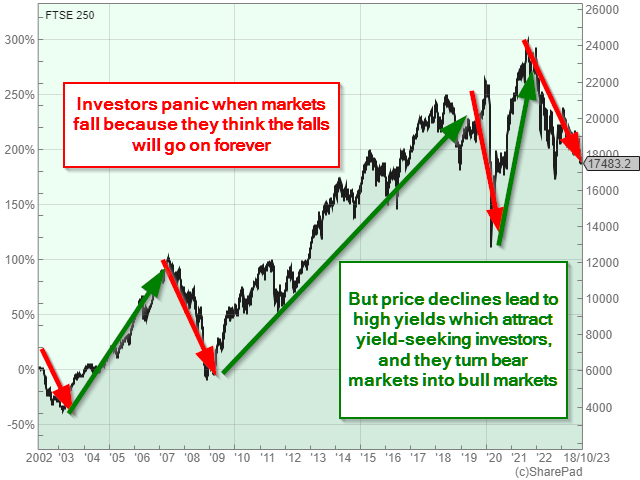
Each and every time over the last 20 or 30 years, low prices and high yields have lured in yield-focused investors. They increased the demand for shares and that was enough to turn bear markets into bull markets, and those bull markets eventually lowered the FTSE 250’s dividend yield from an abnormally high 4% back to its historically normal range of 2.5% to 3%.
Those yield-seeking investors who were brave enough to buy the FTSE 250 (or even just a broad basket of high-yield stocks) when others were panic-selling were, almost unfailingly, rewarded with outstanding capital gains.
That's because low prices and high yields were a clear sign that the FTSE 250 was very cheap in the early 1990s, 2003, 2009 and early 2020, and those signs turned out to be correct.
Of course, there are no guarantees that today's high yields will automatically lead to strong capital gains in the relatively near future, but history suggests that it is very likely.
Update (27/10/23)
Adam (a reader) wanted to see the FTSE 250's CAPE ratio chart, and although I wanted to focus on the FTSE 250's dividend yield in this post, I think a CAPE chart would be a useful addition, so here it is.

The rainbow shows the typical range of values from depression (green, where CAPE is about 12) to average (yellow, where CAPE is around 24) to bubble (red, where CAPE is around 48), and everything in between.
Today, the FTSE 250 has fallen to 16,800 and that puts it squarely into the "very cheap" zone, with a CAPE ratio of 17, which isn't a million miles from depression-level valuations. This is the cheapest the FTSE 250 has been in the last 30 years, other than during the deepest darkest moments of the 2008/2009 global financial crisis.
And while these periods of distress are always unpleasant, the chart above shows that those who can stay invested have historically been rewarded with significant and rapid capital gains.
No time for spreadsheets or annual reports?
If you like this article but don’t have hours each month to dig through company accounts, you might find my monthly investment newsletter useful.
Once a month I send out a plain‑English PDF showing:
- The full UK dividend stocks model portfolio
- Which shares I’m buying, selling, trimming or topping up
- The latest news and trading updates for each holding
- Where we are in the stock market valuation cycle
All designed so a UK investor can stay on top of their dividend portfolio in well under an hour a month.
Get the latest blog posts & a free checklist
Get my latest articles in (at most) one email per week and download my dividend investing checklist. Topics usually include:
- Detailed reviews of high-quality UK dividend stocks
- Updates on my UK dividend stocks portfolio
- FTSE 100 and FTSE 250 valuations
- "How to" articles covering all aspects of dividend investing
No spam. Unsubscribe anytime.