A couple of times each year, I like to step back and look at the forest rather than the trees.
Or, less metaphorically, I like to review my portfolio’s performance and the effectiveness (or lack thereof) of my investment strategy.
So, in this mid-year review of the UK Dividend Stocks Portfolio, I will of course review the portfolio’s performance, but I also want to explain the basics of sensible performance benchmarking and position sizing.
Table of contents
- Acceptable total returns over an appropriate timeframe
- A significantly larger dividend and dividend yield
- Comparing the portfolio against UK Equity Income funds
- Improving the portfolio by owning fewer stocks
- The power of appropriate benchmarks and position sizes
Acceptable total returns over an appropriate timeframe
The UK Dividend Stocks Portfolio invests exclusively in dividend-paying FTSE All-Share stocks so, for fairly obvious reasons, I benchmark it against that index. Specifically, the portfolio has two simple goals:
- Have a higher dividend yield than the FTSE All-Share
- Have a higher total return than the FTSE All-Share over ten years
For a dividend portfolio, the aim of having a high yield isn’t exactly surprising, but focusing on ten-year total returns is somewhat unusual, so I’ll explain.
When most investors look at the performance of an index, a fund or their portfolio, they typically think about short-term returns. By “short-term” you might think I mean days, weeks or months, but when it comes to equity investments, anything less than five years is short-term.
For example, just look at this five-year chart of the Scottish Mortgage Investment Trust’s share price.

Data source: SharePad
From early 2020 to late 2021, the share price almost tripled. I’m sure many shareholders were jumping for joy, but those gains were an illusion and since late 2021, the share price has collapsed by almost 60%. Capital gains have also collapsed, from a peak of almost 180% to barely more than 20%.
This highlights the problem with short-term returns. They can be extremely misleading, and that’s because they’re driven by the emotional ups and downs of short-term investors rather than the real-world progress of the underlying companies.
By way of analogy, imagine someone walking a dog on an elasticated lead across a field, from the bottom-left corner to the top-right corner. Even if the person walks in a completely straight diagonal line, the dog will probably zig and zag all over the place. However, the dog is connected to the person, so it would still follow its owner across the field, but their exact paths would only be loosely related.
If you looked down on the person and their dog from a helicopter, you would see a pattern that looked something like this.

Unfortunately, an investment’s market value is easy to measure with precision, whereas its intrinsic value can only be estimated (using a discounted dividend model). That's why, despite share prices being an unreliable measure of an investment’s true worth, most investors still focus on them because it’s easier than estimating intrinsic value.
Fortunately, the chart above also hints at our salvation.
Although the market value plot moves up and down almost randomly, it eventually trends upwards because its centre of gravity (the investment’s intrinsic value) is moving upwards. This suggests that if we zoom out far enough, changes to an investment’s intrinsic value will begin to overpower the emotionally driven ups and downs of its market value.
Zooming out to look at returns over five years is what most fund managers and the FCA suggest, and that's a good start, but it isn’t enough. In my opinion, most investors would be better served by measuring their portfolio's total returns over at least ten years.
Of course, that doesn’t mean we should ignore returns over one, three or five years. They are useful leading indicators of how your portfolio is doing.
Here's a useful rule of thumb:
- Rule of thumb: Don't worry too much about your portfolio's performance unless it's more than 10% behind its benchmark over any timeframe.
So, if you're 5% behind your benchmark one year, it's probably just the random fluctuations of the market. But if you're 10% behind over one year, five years or ten years, then it's probably worth trying to understand why.
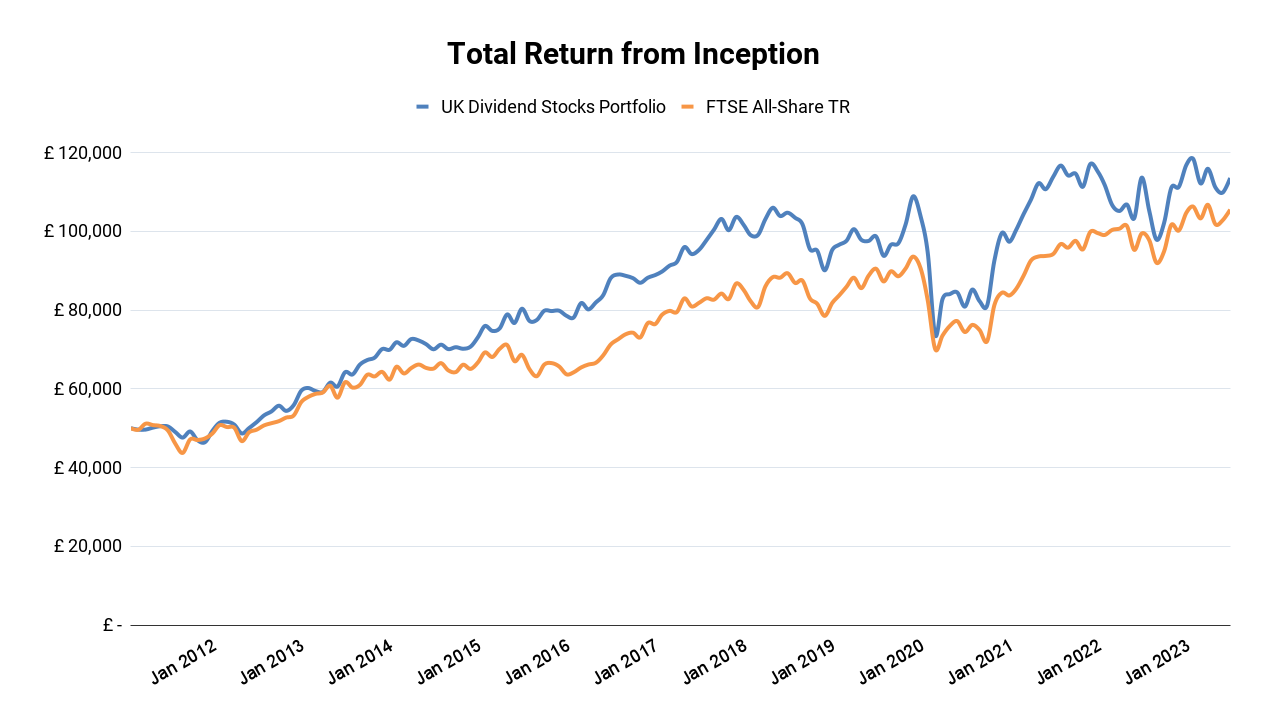
With all of that in mind, here are a couple of charts showing the total return of the UK Dividend Stocks Portfolio over an appropriately long timeframe.

This chart shows total returns from inception in early 2011 and the good news, for me at least, is that the portfolio remains ahead of its FTSE All-Share benchmark, as it has for most of the last 12 years.
And while the degree of outperformance isn’t huge, the truth is that the average investor underperforms the stocks and funds they invest in by at least 1% per year, so as long as you aren’t lagging behind your benchmark by more than 10% over ten years (as I mentioned before), you are probably doing better than the average investor.
How does the average investor manage to underperform their own stocks and funds?
The answer is that most investors make emotional decisions and focus excessively on the short term. As a result, they buy high because they chase performance by buying after an investment has recently gone up, and they sell low because they panic-sell after an investment has recently gone down. Obviously, buying high and selling low is a terrible investment strategy.
Although the previous chart gives us a nice long-term picture, it doesn’t tell us the growth rate of the portfolio or the FTSE All-Share over the last ten years, so here’s a chart that does.

This chart shows the portfolio’s annualised ten-year total return versus its benchmark.
For example, over the ten years from March 2011 to March 2021, the portfolio produced an annualised total return of 7.2% versus 5.5% for the All-Share. To provide some additional context, the chart also shows the very long-term annualised total return of the UK stock market, which is 7% (based on a historical long-term real return of 5% plus an expected long-term inflation rate of 2%).
This is my favourite total return chart because it focuses on an appropriately long timeframe (ten years) and therefore ignores all of the largely irrelevant short-term ups and downs that most investors spend far too much time worrying about.
The dramatic COVID-crash of early 2020, for example, was emotionally devastating for many investors, but it's almost entirely absent from this chart and that is precisely the point. It was a short-lived crash that was largely irrelevant to long-term investors, other than as an opportunity to buy shares in quality companies at low valuations.
You can see from the chart that returns over the last ten or so years have been broadly in line with the long-term average. The latest ten-year annualised total returns are 5.9% for the UK Dividend Stocks Portfolio and 5.5% for the FTSE All-Share, both of which are slightly below the long-term average of 7%. That's understandable because the UK market is obviously quite depressed at the moment.
I expect that depression to lift at some point and when it does, I expect ten-year annualised returns to move back towards and hopefully above 7% once again.
Last but not least, although returns over one, three and five years are merely leading indicators, they are still useful to track so here's a table showing the portfolio's shorter-term returns versus its benchmark.
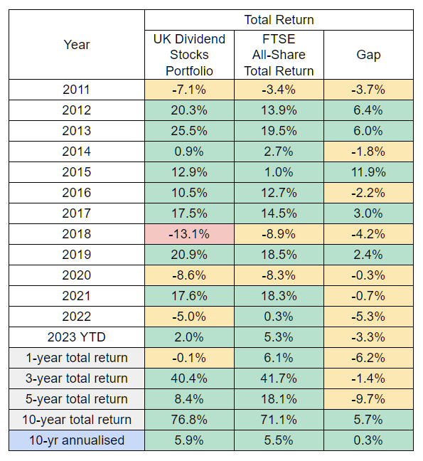
This table shows that the portfolio is behind its benchmark over one, three and five years and over five years it's almost behind by 10%.
Having reviewed where the portfolio is today and where it was five years ago, I am not overly concerned by this short-term underperformance. Instead, as we will soon see, I think the portfolio's underlying companies have made reasonable progress over the last five years, but that has been more than offset by increasingly depressed valuations. I expect this situation to reverse over time, but this is still useful information and it's why tracking short-term returns still has some merit.
However, despite some recent short-term underperformance, the portfolio has achieved its goal of beating the FTSE All-Share's total return over ten years, so let’s turn to its second goal, which is to have a higher yield than the All-Share.
A significantly larger dividend and dividend yield
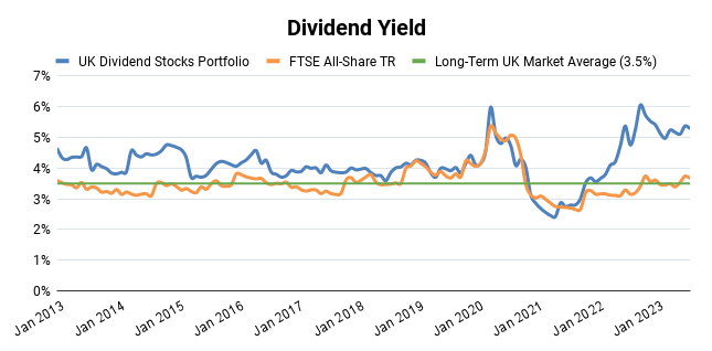
For most of the last ten years, the portfolio’s dividend yield has indeed been ahead of the All-Share’s, with a significant gap opening up over the last year or so. As things stand today (or more specifically, at the beginning of August), the portfolio has a dividend yield of 5.3% and the FTSE All-Share has a yield of 3.7%.
Although the dividend yield is an important metric, what really matters is the absolute amount of income produced by the portfolio, which you can see in the chart below.

This chart shows the rolling 12-month average dividend, which is approximately what you could draw from these portfolios each month to live off without having to sell any shares.
As you can see, the UK Dividend Stocks Portfolio has increased its dividend quite dramatically over the last year or so, to the point where its dividend is now significantly larger than that of its All-Share benchmark. More specifically, its average monthly dividend is now some 55% larger than the benchmark's.
This dramatic increase has been driven by a change in how I manage position sizes for each of the portfolio’s holdings. I’ll explain that in more detail shortly, but first, I want to wrap up this performance review by explaining a new and supplementary benchmark that I think you may find interesting.
Comparing the portfolio against UK Equity Income funds
Having an appropriate index as a benchmark is very sensible, but it’s far from perfect.
For example, in 2022, the FTSE All-Share more or less demolished every other major index on the planet, and handily side-stepped the bear market that gripped the much-loved S&P 500.
The reason, in a nutshell, is that the index is heavily weighted towards AstraZeneca and Shell, both of which returned more than 30% in 2022. These two companies make up about 15% of the All-Share, so their outsized gains gave the index a serious short-term boost.
This highlights the idiosyncratic nature of individual indices. In other words, while the All-Share is a reasonable benchmark, it is far from perfect because it’s just one portfolio with one set of stocks and one approach to weighting those stocks (by market cap).
What if your benchmark managed to have an incredible ten-year run, fuelled by a handful of stocks that everyone (except you) piled into because they thought they could only go up?
You might get depressed or replace your stocks with a passive index because you think you’re a bad investor, when in fact you just temporarily underperformed an unsustainable bubble (think of all the investors who were depressed because they "missed out" on the Scottish Mortgage Trust's "gains").
History tells us indices can be unreliable benchmarks even over ten years, so in addition to a single index benchmark, I think it’s a also good idea to also benchmark your portfolio against a basket of broadly similar portfolios.
In my case, I have started to benchmark the UK Dividend Stocks Portfolio against every UK Equity Income fund tracked by Citywire:
- Citywire - UK Equity Income Funds 10-Year Track Record (click on the link and then click on the "Funds" tab to see fund performance)
Citywire doesn’t have yield information for these funds, but it does have my preferred metric of ten-year total return. My standard for this benchmark is simple:
- Satisfactory Returns: The portfolio’s ten-year total return puts it in the top third of UK equity income funds
- Acceptable Returns: The portfolio’s ten-year total return puts it in the middle third of UK equity income funds
- Unacceptable Returns: The portfolio’s ten-year total return puts it in the bottom third of UK equity income funds
Citywire currently lists 73 UK equity income funds with ten-year total return data, so this is a significantly more diverse and therefore robust benchmark than simply looking at the FTSE All-Share.
How has the portfolio performed in comparison to these 73 professionally managed funds (which excludes funds that were closed because their performance was atrocious)?
The answer is, not too bad.
Over the ten years to the end of July, the UK Dividend Stocks Portfolio produced a total return of 76.8%. The average total return across those 73 equity income funds was 52%, so the portfolio performed better than the average fund.
More importantly, its near-77% return would have placed it 10th out of 73 funds.
10th place is clearly within the top third, so on that basis, I’m comfortable saying that while the portfolio’s performance hasn’t been spectacular, it has been satisfactory relative to a diverse group of its peers.
If you’re interested in benchmarking your portfolio along similar lines, Citywire tracks fund performance across a wide variety of investment sectors.
Improving the portfolio by owning fewer stocks
I want to wrap up this mid-year review by talking about the portfolio’s journey from a bloated 34 holdings in early 2021 to a lean 20 holdings today, and why that’s the main driver behind the portfolio’s massively improved dividend.
The story begins in 2011 when I set up the UK Dividend Stocks Portfolio with 30 holdings. I chose 30 as the target because a combination of research and self-reflection told me that should provide a reasonable balance between returns (by investing in a relatively small number of hopefully attractive stocks) and risk (by avoiding putting too much into any one company, industry or country).
Over the next few years I either purchased a new holding or sold an existing holding, but the total number of holdings stayed close to 30 until 2020. At that point, the stock market crashed, I went on a buying spree and by the end of that year the portfolio had ballooned to 34 holdings.
Around the same time, I made some changes to my investment strategy in order to focus on higher-quality companies, and that increased the amount of research I needed to do for each holding.
With more holdings and more time spent reviewing each holding, It was obvious that 34 holdings would be too many for me to keep track of, so something had to change.
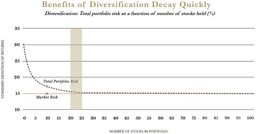
Given that the portfolio would be investing in higher-quality companies, I felt comfortable increasing the average position size and therefore lowering the number of holdings. But how low could that number go without making the portfolio materially riskier than its FTSE All-Share benchmark?
The question of how many stocks you should own in your portfolio has been debated to death, but the general consensus among stock-pickers is that 20 to 30 is the right ballpark (assuming the portfolio is large enough to have that many holdings, otherwise trading fees could meaningfully reduce returns).
Source: Intrinsic Investing Blog
Having managed a 30-stock portfolio for more than ten years, I felt comfortable reducing the target number of holdings from 30 to 20, so I began the process of selling the least attractive holdings (in terms of quality or valuation) and reinvesting the proceeds back into the most attractive holdings.
By the end of 2021, the portfolio was down to 27 holdings, by the end of 2022 it was down to 23 and today it sits at 21 holdings. Here's a list of the last five sales:
- Aug 2022: Why I Sold Telecom Plus After Recent Share Price Gains
- Sep 2022: Is 4imprint a Good Choice for Dividend Investors?
- Dec 2022: Is WH Smith an Attractive Dividend Stock?
- May 2023: Selling Hikma Pharmaceuticals after a 40% share price gain
- Jul 2023: Why I'm selling Beazley after strong share price gains
Along the way, I began to frame the question of "how many holdings" from the point of view of position sizes rather than holdings. In other words, instead of targeting 20 holdings and then adjusting each holding's position size so they all fit within one portfolio, I started putting position sizes first and the number of holdings second.
I won't go into the details because this post is long enough already and I'll cover the topic at length in an upcoming addition to my investment strategy series, but here's the general idea:
- Defensive holdings get a slightly larger default target position size than cyclical holdings (because this is a relatively defensive dividend portfolio)
- I max out a stock's position size only if the expected annualised return is above 10%
- If the expected annualised return is below 10%, the position is reduced on a sliding scale
In practical terms, my average target position size is 4-5%, so I expect the portfolio to stabilise at around 20-25 holdings. Defensive stocks have a target size of between 3% and 6%, depending on valuation, while cyclical stocks have a target size of between 2% and 4%, again, depending on valuation.
I also rebalance positions by trimming or topping them up when they move more than 2% from their target size. However, this isn't a huge amount of work and should only require at most one trim or top-up trade each month.
So far, tilting the portfolio towards its most attractively valued (and typically highest-yielding) holdings has also driven a 34% increase in the portfolio's overall dividend relative to pre-pandemic levels. This gives me confidence that active position sizing is a better approach than simply dumping stocks into a portfolio and letting them get on with it.
You can see the exact position sizing rules in my Company Review Spreadsheet, which is on the Dividend Investing Resources page.
The power of appropriate benchmarks and position sizes
In summary, here's what I hope you'll take from everything I've said:
- Equity investment performance is best measured over ten years
- Returns over one, three and five years can be useful leading indicators of progress
- Unless you're more than 10% behind your benchmark over any given timeframe, there may not be anything to worry about
- Holding fewer companies can make a portfolio easier to manage
- Overweighting the most defensive and most attractively valued holdings may be a good idea
To find out more about my investment strategy, read this post: My 5-step strategy for investing in dividend stocks.
No time for spreadsheets or annual reports?
If you like this article but don’t have hours each month to dig through company accounts, you might find my monthly investment newsletter useful.
Once a month I send out a plain‑English PDF showing:
- The full UK dividend stocks model portfolio
- Which shares I’m buying, selling, trimming or topping up
- The latest news and trading updates for each holding
- Where we are in the stock market valuation cycle
All designed so a UK investor can stay on top of their dividend portfolio in well under an hour a month.
Get the latest blog posts & a free checklist
Get my latest articles in (at most) one email per week and download my dividend investing checklist. Topics usually include:
- Detailed reviews of high-quality UK dividend stocks
- Updates on my UK dividend stocks portfolio
- FTSE 100 and FTSE 250 valuations
- "How to" articles covering all aspects of dividend investing
No spam. Unsubscribe anytime.